Monday, October 22, 2012
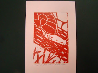
Printmaking Final Print
The overall composition of my final print is balanced. The amount of negative space is similar to the amount of positive space in the foreground, middleground, and background. The print also has unity, each part of the print flows to the next instead of just being a bunch of random shapes. I added texture and contrast to my print by carving lines of different size into the bark of the log and carving lines into the shell of the snail. I added contrast by carving different textures into each part of the print and switching from positive to negatve space so that there wasn't any positive on positive or negative on negative. This is important because it makes the print more life lke and makes the snail easier to see. I used positive and negative space to show my image by surrounding positive space with negative space and negative space with positive space. I think that the craftsmanship of my print is neat, although some of the prints are smudged. I added texture and contrast and carved all of my lines neat and straight. I don;t think that I was able to achieve depth because in real life the grass would be much bigger than the snail if it was in the foreground. Also, the rocks are too big. Since they are in the background they should be much smaller. While printmaking I had trouble figuring out how to show texture because I had never drawn texture before and I didn't know what it was supposed to look like. An advantage I had during this project was that I knew how to carve and print becasue I did printmaking twice in middle school.
Subscribe to:
Post Comments (Atom)

I'm watching you man. look out!!!
ReplyDelete