 My favorite and most successful project this semester was the landscape painting. I think that it turned out really well in the end because I was able to successfully add all of the values and shadows that would have shown up in real life. I enjoyed this project the most because I liked being able to paint what I wanted, how I wanted. There weren't any requirements or rules to follow which made it a lot easier to complete the project as well. Even though the objects in this painting are the sort of thing that would usually go in the background of a picture, I feel like I added enough detail and color for them to stand alone on the canvas. I was a little scared when I first started painting to put any paint on the canvas
,
but once I got used to doing it I started to enjoy it. It was fun to get the chance to try different things with the paint and see what they looked like in the end. I also liked getting to layer the colors on top of each other. I used to think that when you covered up one color you wouldn't be able to see the one underneath it, but now I know that it lets the colors blend together, without actually having to blend them. Overall this was my favorite project because I got the chance to paint things exactly the way I wanted them.
 I think that I developed the most from this project because I learned how to use texture. I used to think that texture was just the way something felt, I never knew that you could actually draw in texture. Ever since I learned how to do this I have been able to improve my artwork because I have been able to make things come to life. I also learned that you should use contrast to make things stand out more. If you have something on a dark background, then it should be light. If you have something on a light background, then it should be dark. Both of these techniques allow you to see the difference between two object in a piece of art. If they look the same then they will blend together and you won't know what you are looking at.
While doing this project I used skills and techniques from almost every other unit in order to complete it. I used texture while molding the clay so that everything would seem more life-like. I used value while painting it in order to make the tile more interesting. I even used shadows, although the tile was already 3-D, in order to make things pop out. I think that I have grown a lot as an artist from learning to use these techniques. I can tell that the more recent projects that I have completed are much better than what I was making in the beginning of the semester. Learning how to add values, contrast, texture, and shadows has allowed be to grow as an artist. I feel like I can make things more realistic and captivating for other people simply by using these concepts.
I feel like this project was the least important in learning the concepts taught in this course. Although it was a good way to start our perspectives unit, I feel like anamorphosis wasn't really related to the type of perspectives that we learned (one point and two point). We practiced some of the earlier concepts while doing this, like value and shading, but overall I feel like we could have spent more time doing something else instead of working on this. Especially since we have practiced value and shading for every other project this semester. I thought that it was fun, but I didn't really see the point behind doing it since we never used anamorphosis later on in the semester. I think that it would have been a more useful project if we had then used anamorphosis for something else later on. Maybe we could have spent less time working on it as well. We spent three days doing the project even though we weren't learning a concept that we would need later on.
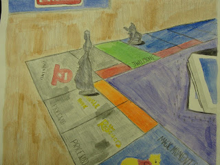
I don't really have any personal connections to the art we have done this semester. I guess that the game drawing sort of counts because it was the Disney version of Monopoly and I love Disney World. I have been there more than ten times and I think that all things Disney are amazing. That's why I chose to draw this board game instead of the one that I brought in, Clue. My favorite part of this project was getting to play the game because I liked being able to see some of the Disney characters on the board. I enjoyed getting to draw some of the characters as well. I think that it was a little bit easier for me because I have seen the characters before so I knew what they were supposed to look like. I guess I had a photo of the game as a reference as well as my memory.
I think that my final piece turned out okay, although it could have looked a lot better if I had added more values, highlights, and shadows with the colored pencils. My final piece was overall fairly successful, it looked as if my drawing was in perspective because I was able to find the horizon and vanishing points in my original picture. I think that overlapping the washes of watercolor with colored pencil worked well. They blended well and gave the drawing more value. If I were to do this project again I would make the colored pencil darker so that everything would stand out more. The most difficult part of this project was making the gradation from color to color. I had to blend different colors together to add value, but it was hard to make it so that they flowed together without ending up as blocks of color. I learned how to draw in perspective while doing this project in order to make things appear life-like and real.
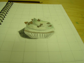
In the lab I used Photoshop to transform my cupcake and make the top of it much larger than the bottom. This disfigured it so that it can only be seen like normal from one perspective. Distorting and stretching the object allowed for it to look more realistic when seen from the correct position. It was important to grid the image so that I could draw it and scale it correctly into my sketchbook. It was also important to use colored pencils to color it in and make it look more realistic, add value to make the anamorphosis drawing look more three dimensional, and shade so that it looked as if the object was coming off the page.
I changed my photo in the lab by putting it into Photoshop and changing the threshold so that the picture was in black and white. I used newspapers as the background for my stencil. They don't relate to my stencil, but I used them because I knew they wouldn't take away from my stencil. I used purple and green watercolor and spray paint because those colors look good together. Positive/Negative space was used to create the stencil. The positive space was cut out so that when I spray painted the objects I cut out showed up black on my collage. The negative space remained the color of the collage. This allowed for contrast between the lights of the green and purple and the darks of the black, allowing for a better composition. While using the Xacto Knife you are supposed to cut away from yourself, but not towards anybody else. You are also supposed to keep it in it's container when you are not using it. To use the knife you cut along the edges of the piece of paper that you want cut out. I found it very hard to cut because it was really hard to get the knife to cut all the way through the paper. I had a very hard time spray painting because it was really hard to get the spray paint out of the bottle. I also forgot to hold down the stencil so when I spray painted a lot of the areas that were supposed to stay white ended up getting spray painted. Color choice is important because you don't want the stencil to get lost in the background.
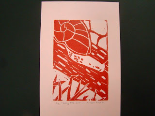
The overall composition of my final print is balanced. The amount of negative space is similar to the amount of positive space in the foreground, middleground, and background. The print also has unity, each part of the print flows to the next instead of just being a bunch of random shapes. I added texture and contrast to my print by carving lines of different size into the bark of the log and carving lines into the shell of the snail. I added contrast by carving different textures into each part of the print and switching from positive to negatve space so that there wasn't any positive on positive or negative on negative. This is important because it makes the print more life lke and makes the snail easier to see. I used positive and negative space to show my image by surrounding positive space with negative space and negative space with positive space. I think that the craftsmanship of my print is neat, although some of the prints are smudged. I added texture and contrast and carved all of my lines neat and straight. I don;t think that I was able to achieve depth because in real life the grass would be much bigger than the snail if it was in the foreground. Also, the rocks are too big. Since they are in the background they should be much smaller. While printmaking I had trouble figuring out how to show texture because I had never drawn texture before and I didn't know what it was supposed to look like. An advantage I had during this project was that I knew how to carve and print becasue I did printmaking twice in middle school.
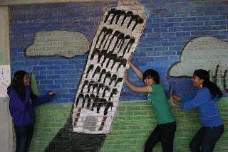
I like that we got to work on a team for this project because it would have taken a painfully long time to finish the chalk mural if we did them on our own. We all shared our ideas about what to do a mural on and then shared our ideas on how to make each one better. We each worked on different parts of the mural and then at the very end we discussed how to make it all come together. It is important to collaborate while working on a team because it allows ideas to be improved. It is also important because if you don't collaborate everybody will end up doing something different. If you collaborate while on a team then you can get things done faster and improve the quality of your work. This project was fairly successful in my opinion.The leaning tower turned out good, but the colors were a little off. I also think that the mural wasn't as realistic as it could be, but it still looks nice. I like making artwork that people can interact with because it's nice to know that my art is being used and isn't just something that hangs on the wall. I also like being able to make something that other people can use and have fun with. It is also a lot of fun to make something that you can mess around with when you are finished.
It is important to have texture in your sketches because it brings the animal and background to life. It shows the details in the object you are drawing in order to show what it really looks like, not just have an outline. It is necessary for you to have several references of each animal and background because it allows you to combine them in order to make your own unique drawing. When I look at my skecthces I can see that my hedgehog will make the best print because it has the most contrast and the most texture out of the three.
 My favorite and most successful project this semester was the landscape painting. I think that it turned out really well in the end because I was able to successfully add all of the values and shadows that would have shown up in real life. I enjoyed this project the most because I liked being able to paint what I wanted, how I wanted. There weren't any requirements or rules to follow which made it a lot easier to complete the project as well. Even though the objects in this painting are the sort of thing that would usually go in the background of a picture, I feel like I added enough detail and color for them to stand alone on the canvas. I was a little scared when I first started painting to put any paint on the canvas, but once I got used to doing it I started to enjoy it. It was fun to get the chance to try different things with the paint and see what they looked like in the end. I also liked getting to layer the colors on top of each other. I used to think that when you covered up one color you wouldn't be able to see the one underneath it, but now I know that it lets the colors blend together, without actually having to blend them. Overall this was my favorite project because I got the chance to paint things exactly the way I wanted them.


