Friday, December 7, 2012
Game Drawing
I think that my final piece turned out okay, although it could have looked a lot better if I had added more values, highlights, and shadows with the colored pencils. My final piece was overall fairly successful, it looked as if my drawing was in perspective because I was able to find the horizon and vanishing points in my original picture. I think that overlapping the washes of watercolor with colored pencil worked well. They blended well and gave the drawing more value. If I were to do this project again I would make the colored pencil darker so that everything would stand out more. The most difficult part of this project was making the gradation from color to color. I had to blend different colors together to add value, but it was hard to make it so that they flowed together without ending up as blocks of color. I learned how to draw in perspective while doing this project in order to make things appear life-like and real.
Wednesday, November 14, 2012
Anamorphosis Drawing
In the lab I used Photoshop to transform my cupcake and make the top of it much larger than the bottom. This disfigured it so that it can only be seen like normal from one perspective. Distorting and stretching the object allowed for it to look more realistic when seen from the correct position. It was important to grid the image so that I could draw it and scale it correctly into my sketchbook. It was also important to use colored pencils to color it in and make it look more realistic, add value to make the anamorphosis drawing look more three dimensional, and shade so that it looked as if the object was coming off the page.
Art Stencil
I changed my photo in the lab by putting it into Photoshop and changing the threshold so that the picture was in black and white. I used newspapers as the background for my stencil. They don't relate to my stencil, but I used them because I knew they wouldn't take away from my stencil. I used purple and green watercolor and spray paint because those colors look good together. Positive/Negative space was used to create the stencil. The positive space was cut out so that when I spray painted the objects I cut out showed up black on my collage. The negative space remained the color of the collage. This allowed for contrast between the lights of the green and purple and the darks of the black, allowing for a better composition. While using the Xacto Knife you are supposed to cut away from yourself, but not towards anybody else. You are also supposed to keep it in it's container when you are not using it. To use the knife you cut along the edges of the piece of paper that you want cut out. I found it very hard to cut because it was really hard to get the knife to cut all the way through the paper. I had a very hard time spray painting because it was really hard to get the spray paint out of the bottle. I also forgot to hold down the stencil so when I spray painted a lot of the areas that were supposed to stay white ended up getting spray painted. Color choice is important because you don't want the stencil to get lost in the background.
Monday, October 22, 2012
Printmaking Final Print
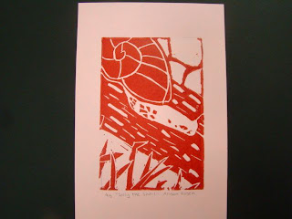
The overall composition of my final print is balanced. The amount of negative space is similar to the amount of positive space in the foreground, middleground, and background. The print also has unity, each part of the print flows to the next instead of just being a bunch of random shapes. I added texture and contrast to my print by carving lines of different size into the bark of the log and carving lines into the shell of the snail. I added contrast by carving different textures into each part of the print and switching from positive to negatve space so that there wasn't any positive on positive or negative on negative. This is important because it makes the print more life lke and makes the snail easier to see. I used positive and negative space to show my image by surrounding positive space with negative space and negative space with positive space. I think that the craftsmanship of my print is neat, although some of the prints are smudged. I added texture and contrast and carved all of my lines neat and straight. I don;t think that I was able to achieve depth because in real life the grass would be much bigger than the snail if it was in the foreground. Also, the rocks are too big. Since they are in the background they should be much smaller. While printmaking I had trouble figuring out how to show texture because I had never drawn texture before and I didn't know what it was supposed to look like. An advantage I had during this project was that I knew how to carve and print becasue I did printmaking twice in middle school.
Thursday, October 4, 2012
Interactive Chalk Mural
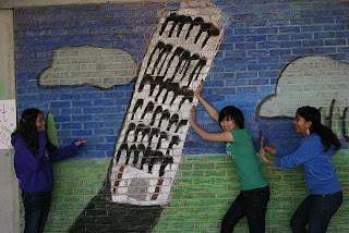
I like that we got to work on a team for this project because it would have taken a painfully long time to finish the chalk mural if we did them on our own. We all shared our ideas about what to do a mural on and then shared our ideas on how to make each one better. We each worked on different parts of the mural and then at the very end we discussed how to make it all come together. It is important to collaborate while working on a team because it allows ideas to be improved. It is also important because if you don't collaborate everybody will end up doing something different. If you collaborate while on a team then you can get things done faster and improve the quality of your work. This project was fairly successful in my opinion.The leaning tower turned out good, but the colors were a little off. I also think that the mural wasn't as realistic as it could be, but it still looks nice. I like making artwork that people can interact with because it's nice to know that my art is being used and isn't just something that hangs on the wall. I also like being able to make something that other people can use and have fun with. It is also a lot of fun to make something that you can mess around with when you are finished.
Printmaking Sketch
It is important to have texture in your sketches because it brings the animal and background to life. It shows the details in the object you are drawing in order to show what it really looks like, not just have an outline. It is necessary for you to have several references of each animal and background because it allows you to combine them in order to make your own unique drawing. When I look at my skecthces I can see that my hedgehog will make the best print because it has the most contrast and the most texture out of the three.
Thursday, September 20, 2012
Value Portrait
 In order to develop my drawing I placed a sheet of translucent paper over a picture. Then I placed the picture on the window and outlined all of the different shaded areas. After that I shaded the entire backside
of the paper and placed it, face up, on a piece of blank drawing paper where I drew over the outlines in order to transfer them onto the drawing paper. Once they were transferred I shaded in the portrait and blended in the colors. I found the different values in the portrait by putting the picture up against the window so that the sun could shine through it and I could see the different shades. I received a full range of values in my portrait by using different shades to make the darker and lighter areas blend together. I added the extreme values and then went back over with the ones in between to fill any gaps and make the portrait more realistic. I think that the overall craftsmanship of the portrait was okay, although I don't think that the drawing looks very much like the picture. I also think that I didn't do a very good job blending, but other than that I think that I executed and crafted the drawing neatly. While drawing the portrait I I had trouble making the drawing look like the picture because it was very hard to match some of the features in the picture. I couldn't figure out where to shade to make the features pop out, so I tried to think about where it would be darker based on where the light was coming from.
Friday, September 7, 2012
Oil Pastel Drawing
 I think that my final piece turned out okay, although I didn't blend the oil pastels well enough. My final product was successful in giving the 3-D effect that the shading was meant to give and overall it looked nice. Originally I tried to shade by coloring in the shapes in sections, but I found that in order to bled the colors you need to layer the oil pastels on top of each other. If I were to do this project again I would make the shapes bigger and try not to color in a shape with the wrong color, because it is very hard to fix. The most difficult part of completing this piece was probably the blending because it was hard to get the pastels to look like they were gradually changing from one to the next without getting lines of color. I learned that you have to be patient and take your time while working ion this piece because it took a while to get the colors to blend correctly.
Subscribe to:
Posts (Atom)


